
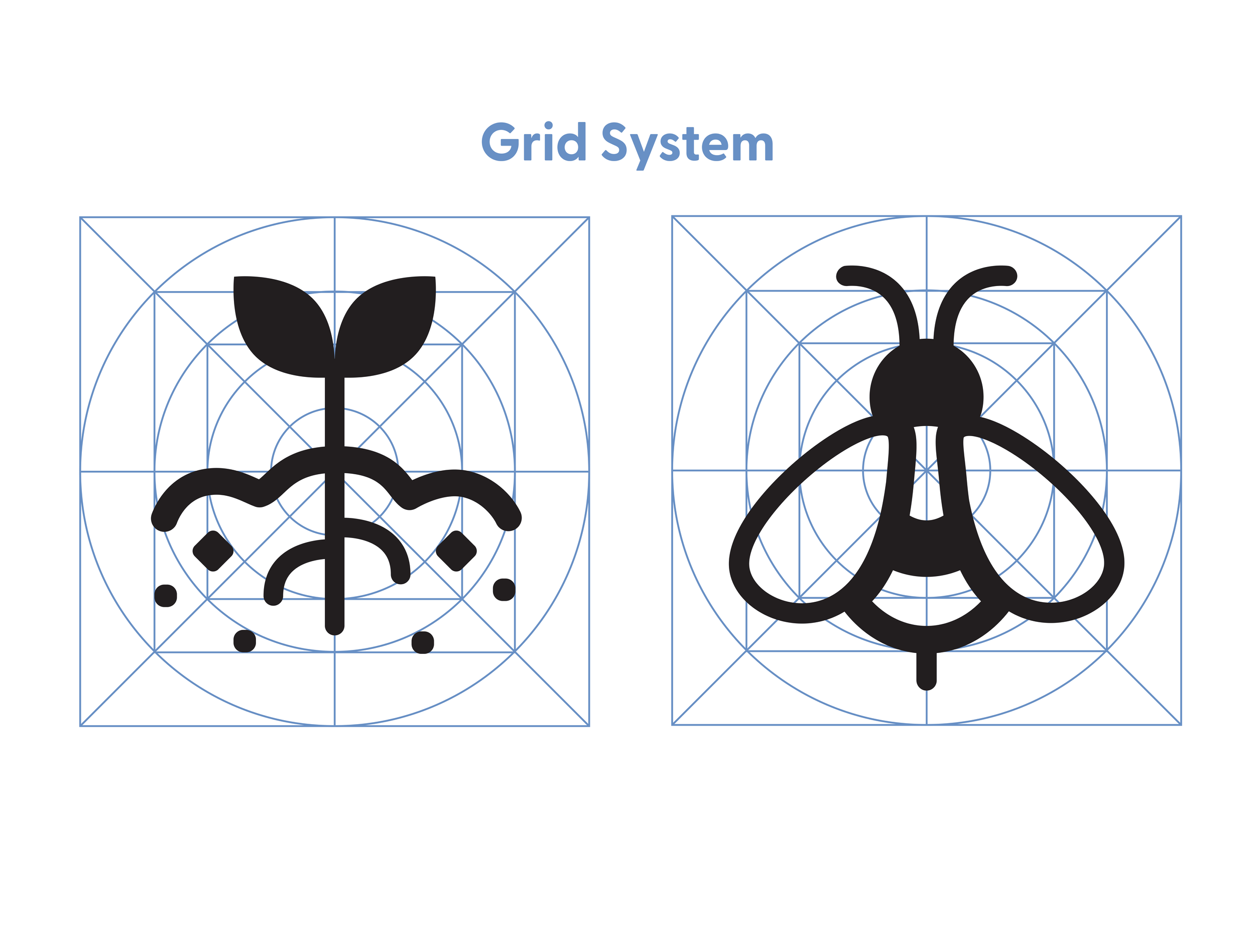
Park Sign Icons
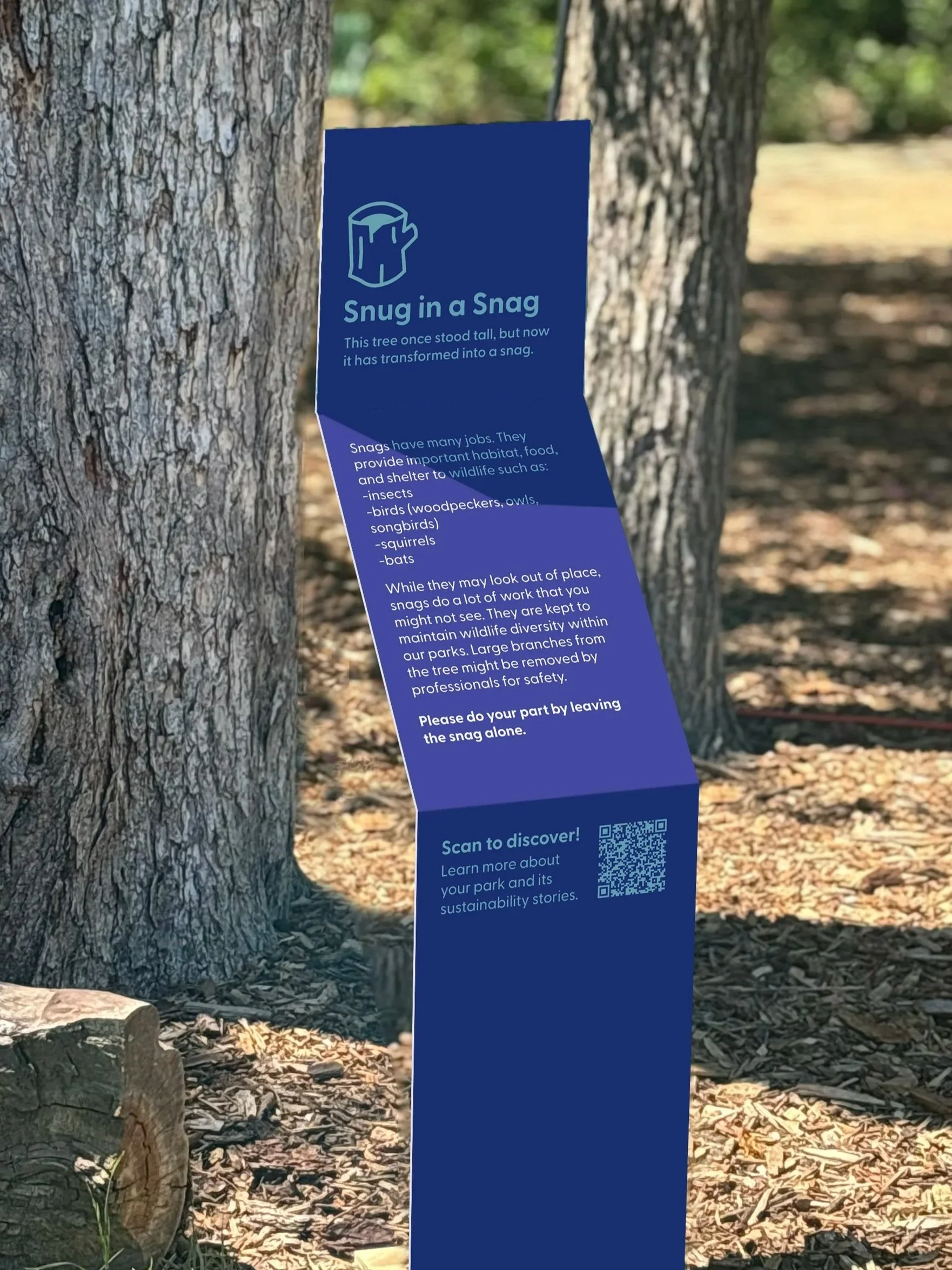
Designing for Sustainability
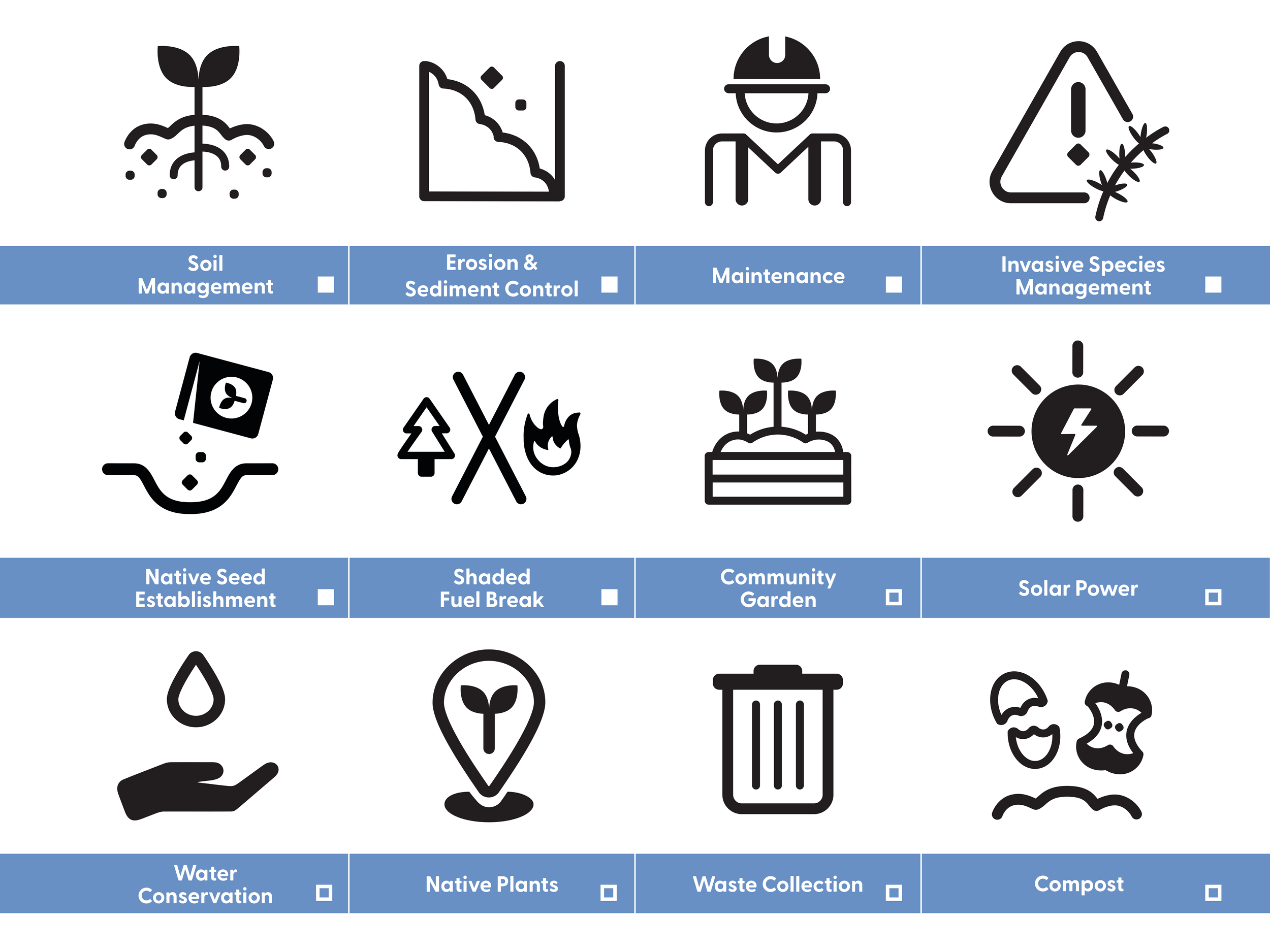
The goal development of icons for the Austin Parks and Recreation Department goes beyond conventional applications such as way-finding, instead it focuses on a entirely new topic addressing the distinct objective of public education around sustainability.
This system of icons functions as an accessible entry point for park-goers, translating complex environmental concepts into simplified, legible visual forms. In doing so, the icons establish a framework for fostering environmental awareness among a broad public audience.
wkrm x Austin Parks and Recreation Department
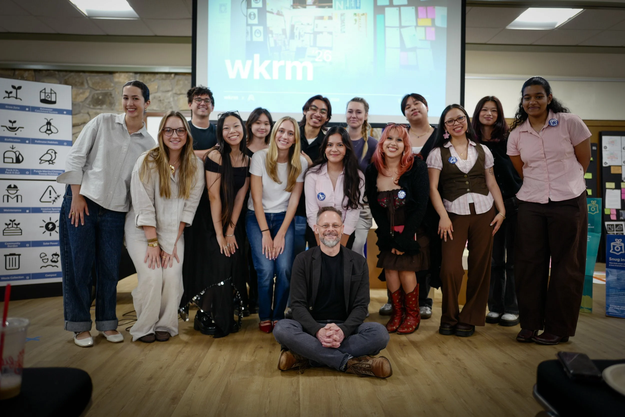
wkrm is a student-run, faculty-led design studio housed at the Department of Fine Arts building at the University of Texas at Austin.
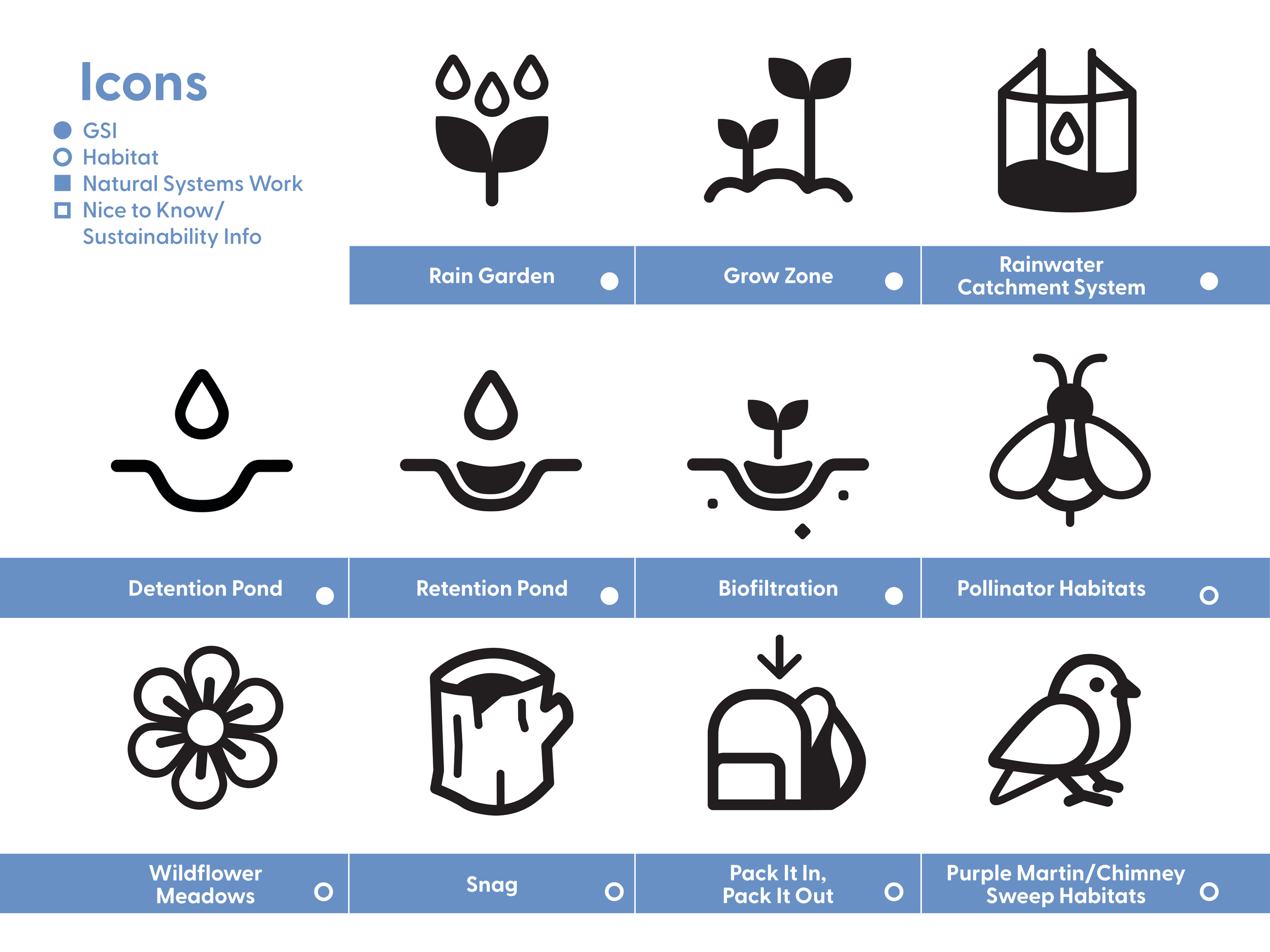
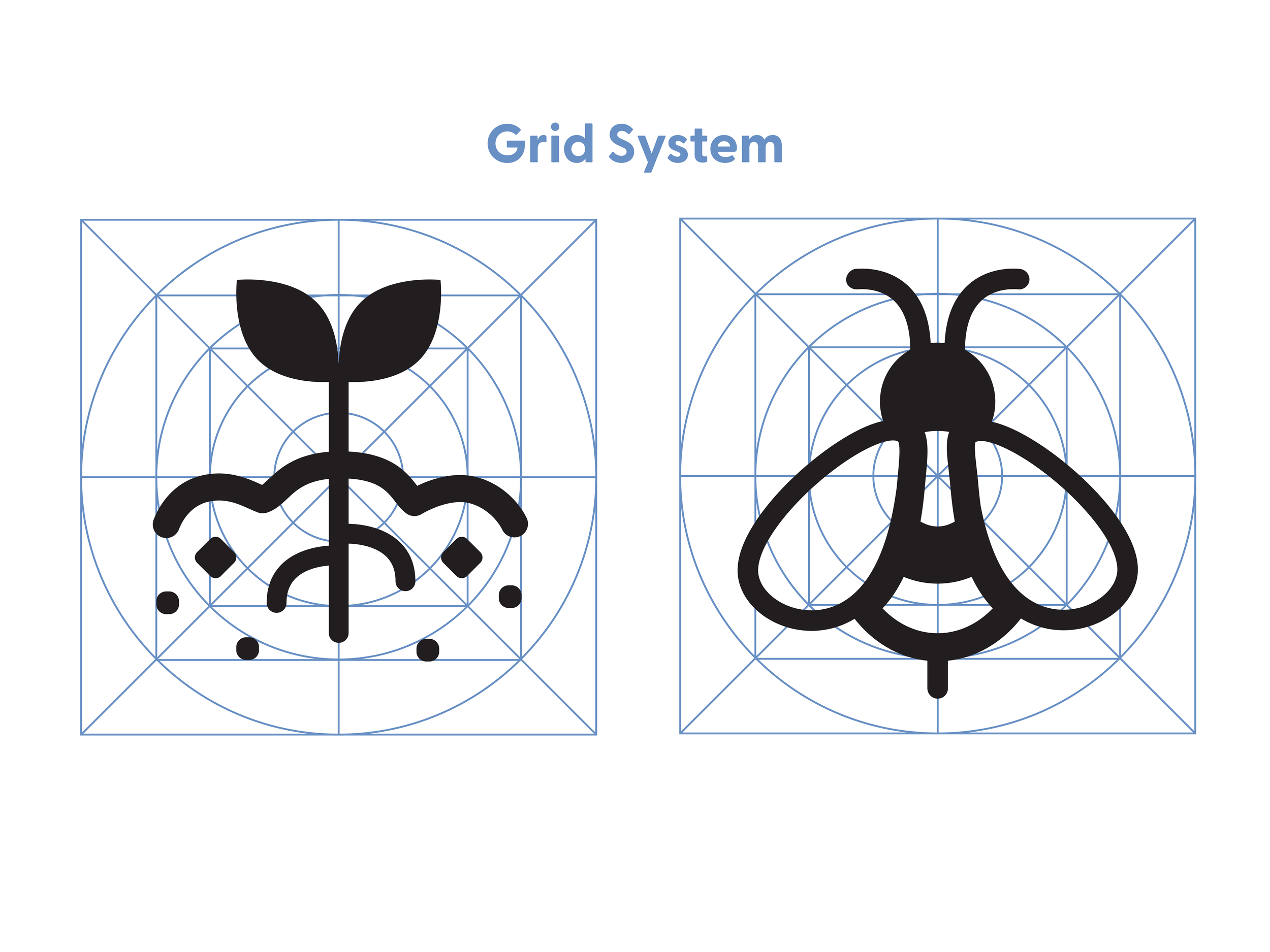
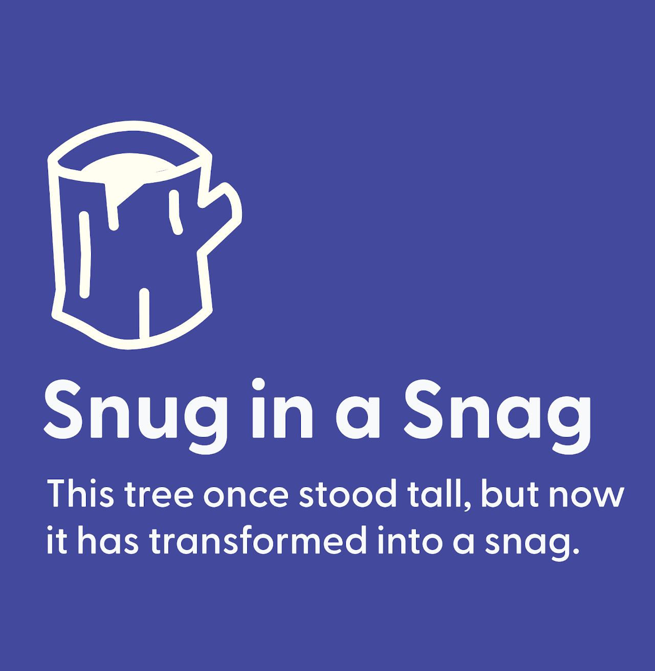
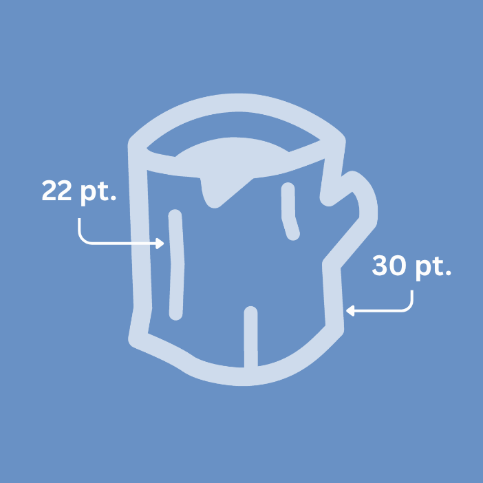
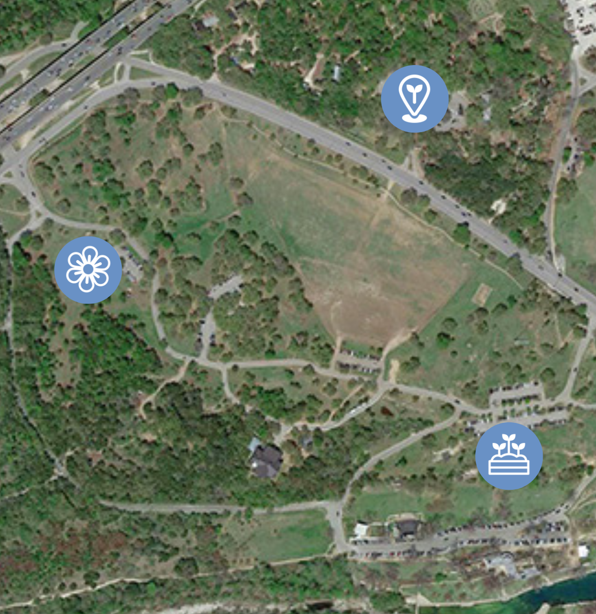
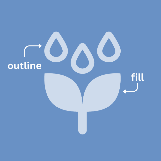
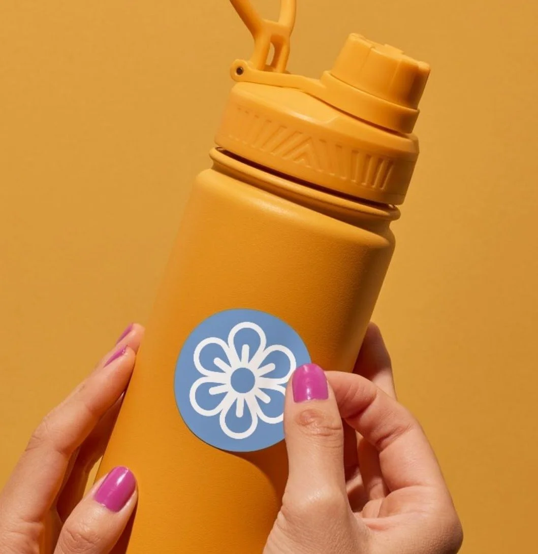
The Spring ’26 WKRM continued the work initiated by the Fall ’25 cohort, engaging in iterative testing and refinement of 10 existing icon designs while also developing additional icons to address identified gaps. This process culminated in a comprehensive set of 23 icons intended for implementation across park signage.
Testing
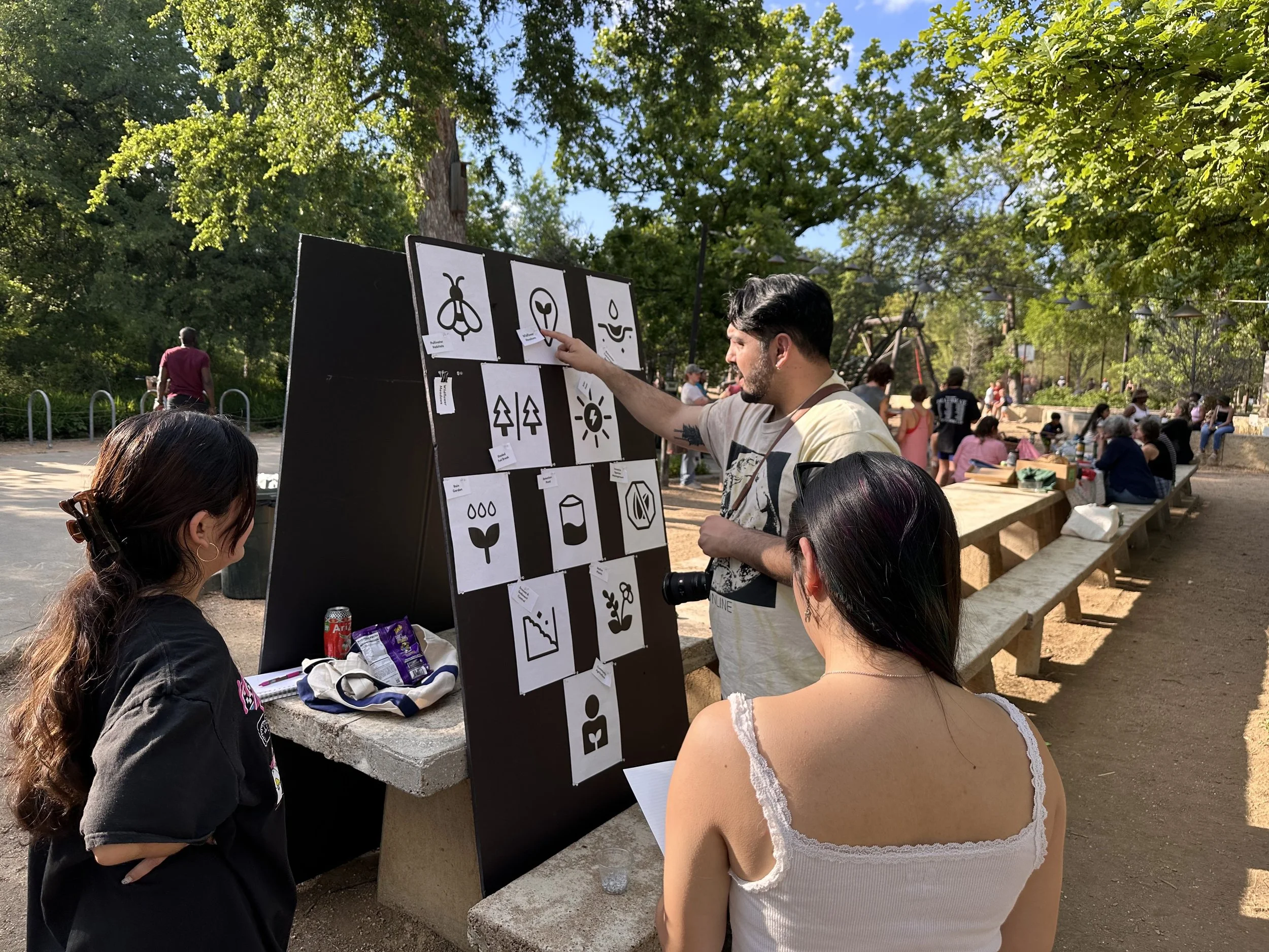
Research for the icon designs included case studies of Olympic icons, a digital survey conducted with UT Austin students, and two rounds of in-person testing at parks, where public park-goers matched terms to the icons to determine how effectively the icons communicated the intended concepts.
For in-person park testing, each icon was printed and placed on boards, with icon labels printed separately. The boards were then taken to Pease Park. Random park-goers were asked to match the icon names to the icons on the board to gauge how well the graphics communicated the sustainability terms. Each test result was recorded, and some participants were asked to elaborate on why they made certain pairings to determine which design choices worked and which did not.
We performed this test on two separate days, receiving 10 participants during the first round and 20 participants during the second round. We were able to gather feedback from a wide variety of park-goers, from elementary school children to working adults, with a range of professions and hobbies, including UX design and botany. The second round of testing validated many of our design choices and made clear the details that still needed refinement.